START Car Sharing Platform Optimization
Deliverables
Wireframes
App & WeChat Mini program Prototypes
A UX writing documentation
A user journey map
My role
User researcher
UX designer
UX writer
Data impacts
Verification passing rate +10%
Over 1/3 users chose our new designed deposit on the first day of launching
The number of message has increased by 100%
The messaging response rate within 3 mins has been increased by 65%
Context
Since 2011
START (was named PPzuche and founded in 2011) is Asia’s first peer to peer car sharing service, which helps car owners rent out their cars when they are not using it to earn extra income; Also helps car drivers access cars nearby at low cost. It saves environment and eases traffic.
Through 2017
We made some substantial improvements over the course of a few years. When I joined START, START app was justed improved from PPzuche in March, 2017. The user experience was not very crucial, some features were still lagging behind, and the UI was in need of an update. I work with product managers, UI designers and app developers together. Several exciting redesign projects have been developed successfully in 10 months. And more projects will be launched shortly.

01 Key goals
Several redesign projects based on START app have been done in order to improve the user experience. Before, our young product paid more attention to features, enabling users to find cars and rent cars. Now, user experience has become our first focus, which helps users find or rent cars easily and smoothly.
02 Understanding existing platform
Understanding users and locating pain points
Interviews, focus groups and usability testings have been conducted to learn about target users’ pain points and needs.
Verification distracting the order placing process
While new users placing orders, they are required to complete the driver verification first. Due to the distraction of the process, bouncing out rate is high, and the conversion rate of new users decreased fast.
Time-consuming to place an order
Complex deposit process
Currently, users are charged deposit every time they want to use a car, which is very complex and a waste of time to repeat.
Difficult to find information users need
There are many details that we put in the car listing page, detail page and user personal page. However, they are all lack of organization.
As a result, it’s difficult for users to locate and find information effortlessly.
Difficult to hand over the car
Users cannot talk to car owners easily, which makes the hand-over process very difficult.
2. Difficult to rent a suitable car
After doing UX research on current platform, we consolidated our guiding principles and product requirements.
Define Success
Keep it simple and clear
We need to provide ease of interaction and a reduced effort for users to avoid extra learning effort.
->
Reduce unnecessary distractions. Make the flow more natural for new users and regular users.
Make sure the information explicate the right messages directly without misunderstanding.
Keep it efficient
We need to provide well organized information architecture to help users get key information and locate the suitable car efficiently.
->
Make sure users locate information organized according to their prioritization.
Organized information and features based on proximity.
Provide enough feedback
We need to inform users every update during the whole ordering and hand-over process. Otherwise, they may feel lost and feel confused, which may result in cancellation and bad experience.
->
Make sure users get enough feedback in time from either the car owner or the platform official.
Make sure the instant messaging tempo and content from both sides can be well controlled.
DESIGN PRINCIPLES
REQUIREMENTS
03 Design
PAIN POINT 1
Time-consuming to place an order
USER GOAL
I can place an order effortlessly.
METRICS
Time on task
Verification passing rate
Number of selection rate
DESIGN CHALLENGE 1
HMW make this process fast, natural and effortless?
SOLUTION 1A
A faster way for new users to place an order
Before, new users had to verify their driver’s licenses before selecting a car.
However, as for newcomers, they are not familiar with START and many of them are cautious about the new platform at first. As a result, some new users chose to bounce out at the very beginning.
BEFORE
If new users try to book cars, they are led to verify their driver’s license before placing the order. And when they complete and pass the verification, they will be sent back to the car detail page, and they need to click the booking button again.
Also, if the verification caused a long time, what they can do is just wait. The distraction of the ordering process is very strong.
AFTER
Through postponing the verification step and integrating it into the order placing process. Users are allowed to place the order and verify their driver’s license in a real using car context, which help them focus on the process of selecting a car they like.
The new flow enables users to check order details at the same time. While the verification is pending, they can still spend the waiting time confirming other information.
SOLUTION 1B
A faster way for regular users to place an order
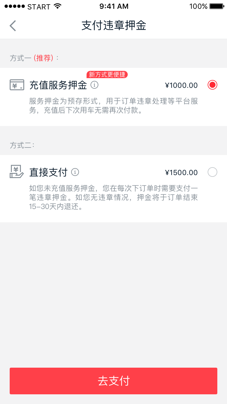
Before, the user are charged deposit every time they want to use a car. To many regular users, this is a waste of time. In order to help them focus on selecting and placing order effortlessly, another flow of deposit charging process has been added.
This new kind of deposit has been designed to integrate with the old kind of deposit. Recommendations have been added to populize the new one, but users can still choose which way to go. In this way, former users who has established habit of using old kind of deposit will not be uncomfortable about the change.
Data impacts 1
During the first two weeks after launching the project, the pass rate of verification have increased by 10%.
The number of choosing the new kind of deposit during placing the order was great since the first day of launching the project, which is 33%. This data means the redesign has satisfied many users’ need, and the users could accept the new concept easily.
PAIN POINT 2
Difficult to rent a suitable car
USER GOAL
I can get information and feedback quickly.
I can rent a car effortlessly.
METRICS
Task success rate
Messaging response rate
DESIGN CHALLENGE 2
HMW make this process fast, natural and effortless?
SOLUTION 2A
Less distance when looking for information
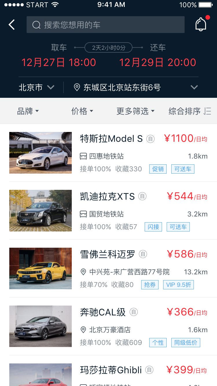
There is lots of information in current car listing page and car detail page, which are the two key pages that influence the decision making. According to interview and usability testing, we found out what users really care about and to be more specific, what is their prioritization. Based on the results, we reorganized the information architecture of the three pages to help them catch the information quickly.
BEFORE
Higher efficiency of screen display
Priority optimization
According to interviews, those more important details have been prioritized.
Law of proximity
I put one kind of information at one place. For example, the information of car owners and his/her descriptions should be placed together. However, in the old version, these two parts are far away. At the same time, they strongly expect to see how the owner describe the car in a unique way, since every car in our platform belongs to individuals. I do find many interesting descriptions written by car owners which is a pity that users usually ignore them unintentionally.
Make sure the icon works
For C2C platform, different car owners have different restrictions, in which case, the way to show should be explicit. As a result, although icon is more good-looking, restrictions be expressed as plain text rather than as icons.
BEFORE
AFTER
AFTER
According to user interviews, I got clearer insights of the context when users are looking for a car through our app. The car list page must select and show the most important information.
Some unnecessary information have been deleted, eg.
detailed address
(since there is already distance data, which is more important and enough for users while quickly scanning the list.)
Inspired by users would consider cars that they have liked first to save time, marking those liked cars at listing page can help them find a suitable car quickly. As a result, they don’t need to go to the like list separately.
SOLUTION 2B
Instant messaging
Currently, our instant message entrance is very hard to be found. According to data analysis, we found that the user likes talking about car related things through our platform. We hope messaging feature can play a greater role in providing enough feedback.
The entrance has been added into detail page
Related information shows in the instant messaging window in order to control the process
A documentation of copywriting has been designed for each specific order status to provide enough feedback and help users move forward
Binding WeChat (one popular Chinese social media) account invitation has been moved to the instant message page for users to get feedback in time.
Data impacts 2
The amount of the message has increased by 100%
The number of the car owners who use the instant message increased by 10%
The response rate within 3 mins has been increased by 65%
04 What’s more
HMW design the car sharing experience more naturally?
Exploration 1
A fun user interface to connect car drivers or potential users on the road
An O2O marketing tool START car stickers for car owners to show their cars offline by using their cars to do the advertising itself. People can scan the QR code and land in an online page to get the car details and rent information more directly. Further sticker shopping mall prototype has also been designed for car owners.
Exploration 2
A WeChat mini program to connect car drivers and owners who live or work closely in real world
To make the car owners and car drivers actively interact with each other. What we want to do is to help them reorganize the supplies and demands.
Those cars around you could all be like your cars. You can just go downstairs and drive them out. And when you drive back home, the hand-over process could be done automatically.


